


revision:
        &lgt;main>
          &lgt;div class="circles circle1">&lgt;/div>
          &lgt;div class="circles circle2">&lgt;/div>
          &lgt;div class="circles circle3">&lgt;/div>
          &lgt;div class="circles circle4">&lgt;/div>
          &lgt;div class="circles circle5">&lgt;/div>

        &lgt;/main>
        &lgt;style>
            main {display: grid; grid-template-columns: repeat(5, 1fr); place-items: center; padding: 2vw; border: 0.2vw solid blue; width: 80vw; height: 20vw; margin-left: 10vw;}
            .circles{background-color: darkblue; clip-path: circle(10vw at 50% 50%); height: 10vw; width: 10vw; border-radius: 50%; }
            .circle1 {animation-name: Circle; animation-duration: 3s; animation-timing-function: ease-in; animation-iteration-count: infinite;}
            .circle2{animation-name: Circle1; animation-duration: 6s; animation-timing-function: ease-out; animation-iteration-count:infinite;}
            .circle3{animation-name: Circle2; animation-duration: 8s; animation-timing-function: ease-out; animation-iteration-count:infinite;}
            .circle4{animation-name: Circle3; animation-duration: 10s; animation-timing-function: ease-out; animation-iteration-count:infinite;}
            .circle5{animation-name: Circle4; animation-duration: 12s; animation-timing-function: ease-out; animation-iteration-count:infinite;}

            @keyframes Circle {
                0%, 100% {background: darkred; clip-path: circle(50%); }
                50% {background: #ffd700;  clip-path: circle(1vw at 35% 35%); transform: translateX (-12vw);}
            }
            @keyframes Circle1 {
                0%, 100% {background: darkblue; clip-path: circle(40%); }
                50% {background: lightgreen;  clip-path: circle(1vw at -40% -40%); transform: translateX (12vw);}
            }
            @keyframes Circle2 {
                0%, 100% {background: darkgreen; clip-path: circle(60%); }
                50% {background: lightgreen;  clip-path: circle(1vw at 10% 10%); transform: translateX (-12vw);}
            }
            @keyframes Circle3 {
                0%, 100% {background: black; clip-path: circle(30%); }
                50% {background: lightgreen;  clip-path: circle(1vw at 15% 15%); transform: translateX (12vw);}
            }
            @keyframes Circle4 {
                0%, 100% {background: white; clip-path: circle(70%); }
                50% {background: lightgreen;  clip-path: circle(1vw at -25% -25%); transform: translateX (-12vw);}
            }
        &lgt;/style>
        &lgt;div class="main">
          &lgt;div class="squares square1">&lgt;/div>
          &lgt;div class="squares square2">&lgt;/div>
          &lgt;div class="squares square3">&lgt;/div>
          &lgt;div class="squares square4">&lgt;/div>
          &lgt;div class="squares square5">&lgt;/div>
        &lgt;/div>
        &lgt;style>
            .main {display: grid; grid-template-columns: repeat(5, 1fr); place-items: center; padding: 2em; border: 0.2vw solid blue; width: 80vw; height: 20vw; margin-left: 10vw;}
            .squares{width: 10vw; height: 10vw; background-image: linear-gradient(to right, blue, crimson);clip-path: polygon(20% 0%, 80% 0%, 100% 100%, 0% 100%);}
            .square1{animation-name: Squares; animation-duration: 4s; animation-direction: alternate-reverse;  animation-iteration-count: infinite;}
            .square2{animation-name: Squares1; animation-duration: 8s; animation-direction: alternate-reverse;  animation-iteration-count: infinite;}
            .square3{animation-name: Squares2; animation-duration: 4s; animation-direction: alternate-reverse;  animation-iteration-count: infinite;}
            .square4{animation-name: Squares3; animation-duration: 8s; animation-direction: alternate-reverse;  animation-iteration-count: infinite;}
            .square5{animation-name: Squares4; animation-duration: 4s; animation-direction: alternate-reverse;  animation-iteration-count: infinite;}

            @keyframes Squares {
                25% {background-image: linear-gradient(to right, #f0c27b, #4b1248); clip-path: polygon(20% 0%, 100% 40%, 70% 100%, 10% 100%);}
                50% {background-image: linear-gradient(to right, #c21500, #ffc500); clip-path: polygon(0% 45%, 100% 20%, 50% 75%, 0% 100%);}
                75% {background-image: linear-gradient(to right, #00d2ff, #3a7bd5);clip-path: polygon(100% 38%, 100% 38%, 66% 100%, 0% 53%);}
            }
            @keyframes Squares1 {
                25% {background-image: linear-gradient(to right, #f0c27b, #4b1248); clip-path: polygon(20% 0%, 100% 40%, 70% 100%, 10% 100%);}
                50% {background-image: linear-gradient(to right, #c21500, #ffc500); clip-path: polygon(45% 0%, 20% 100%, 75% 50%, 100% 0%);}
                75% {background-image: linear-gradient(to right, #00d2ff, #3a7bd5);clip-path: polygon(38% 100%, 38% 100%, 100% 66%, 53% 0%);}
            }
            @keyframes Squares2 {
                25% {background-image: linear-gradient(to right, #f0c27b, #4b1248); clip-path: polygon(20% 0%, 40% 100%, 100% 70%, 10% 100%);}
                50% {background-image: linear-gradient(to right, #c21500, #ffc500); clip-path: polygon(45% 0%, 100% 20%, 75% 50%, 100% 0%);}
                75% {background-image: linear-gradient(to right, #00d2ff, #3a7bd5);clip-path: polygon(38% 100%, 38% 100%, 66% 100%, 53% 0%);}
            }
            @keyframes Squares3 {
                25% {background-image: linear-gradient(to right, #f0c27b, #4b1248); clip-path: polygon(0% 20%, 100% 40%, 70% 100%, 10% 100%);}
                50% {background-image: linear-gradient(to right, #c21500, #ffc500); clip-path: polygon(0% 45%, 20% 100%, 75% 50%, 100% 0%);}
                75% {background-image: linear-gradient(to right, #00d2ff, #3a7bd5);clip-path: polygon(100% 38%, 38% 100%, 100% 66%, 53% 0%);}
            }
            @keyframes Squares4 {
                25% {background-image: linear-gradient(to right, #f0c27b, #4b1248); clip-path: polygon(20% 0%, 40% 100%, 70% 100%, 10% 100%);}
                50% {background-image: linear-gradient(to right, #c21500, #ffc500); clip-path: polygon(45% 0%, 100% 20%, 75% 50%, 100% 0%);}
                75% {background-image: linear-gradient(to right, #00d2ff, #3a7bd5);clip-path: polygon(38% 100%, 100% 38%, 100% 66%, 53% 0%);}
            }
        &lgt;/style>


&lgt;div class="main2">
&lgt;img class="pic" src="../images/tesla.jpg" alt="tesla" />
&lgt;img class="pic1" src="../images/tesla.jpg" alt="tesla" />
&lgt;img class="pic2" src="../images/tesla.jpg" alt="tesla" />
&lgt;img class="pic3" src="../images/tesla.jpg" alt="tesla" />
&lgt;img class="pic4" src="../images/tesla.jpg" alt="tesla" />
&lgt;/div>
&lgt;style>
.main2 {display: grid; grid-template-columns: repeat(5, 1fr); place-items: center; padding: 2em;border: 0.2vw solid blue; width: 80vw; height: 20vw; margin-left: 10vw;}
.main2 img {width: 10vw;}
.pic{animation-name: Shapes; animation-duration: 3s; animation-iteration-count: infinite;}
.pic1{animation-name: Shapes1; animation-duration: 4s; animation-iteration-count: infinite;}
.pic2{animation-name: Shapes2; animation-duration: 5s; animation-iteration-count: infinite;}
.pic3{animation-name: Shapes3; animation-duration: 6s; animation-iteration-count: infinite;}
.pic4{animation-name: Shapes4; animation-duration: 7s; animation-iteration-count: infinite;}
@keyframes Shapes {
0% {clip-path: polygon(50% 0%, 100% 38%, 82% 100%, 18% 100%, 100% 38%);}
50% {clip-path: polygon(50% 50%, 90% 88%, 80% 10%, 20% 10%, 8% 90%);}
75% {clip-path: polygon(50% 0%, 100% 38%, 82% 100%, 18% 100%, 0% 100%);}
}
@keyframes Shapes1 {
0% {clip-path: polygon(0% 50%, 100% 38%, 82% 100%, 18% 100%, 38% 100%);}
50% {clip-path: polygon(50% 50%, 90% 88%, 80% 10%, 20% 10%, 90% 8%);}
75% {clip-path: polygon(50% 0%, 100% 38%, 82% 100%, 18% 100%, 0% 100%);}
}
@keyframes Shapes2 {
0% {clip-path: polygon(0% 50%, 50% 38%, 82% 100%, 18% 100%, 38% 10%);}
50% {clip-path: polygon(50% 50%, 50% 88%, 80% 10%, 20% 10%, 90% 80%);}
75% {clip-path: polygon(50% 0%, 50% 38%, 82% 100%, 18% 100%, 0% 10%);}
}
@keyframes Shapes3 {
0% {clip-path: polygon(0% 50%, 100% 38%, 82% 10%, 18% 100%, 38% 100%);}
50% {clip-path: polygon(50% 50%, 90% 88%, 8% 10%, 20% 10%, 90% 8%);}
75% {clip-path: polygon(50% 0%, 100% 38%, 82% 10%, 18% 100%, 0% 100%);}
}
@keyframes Shapes4 {
0% {clip-path: polygon(0% 50%, 100% 38%, 82% 100%, 10% 100%, 38% 100%);}
50% {clip-path: polygon(50% 50%, 90% 88%, 80% 10%, 10% 10%, 90% 8%);}
75% {clip-path: polygon(50% 0%, 100% 68%, 82% 100%, 60% 100%, 10% 100%);}
}
&lgt;/style>
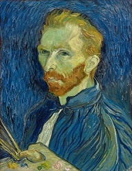


&lgt;div class="main3">
&lgt;img class="vg" src="../images/vangogh.jpg" alt="vangogh"/>
&lgt;img class="vg1" src="../images/vangogh.jpg" alt="vangogh"/>
&lgt;img class="vg2" src="../images/vangogh.jpg" alt="vangogh"/>
&lgt;img class="vg3" src="../images/vangogh.jpg" alt="vangogh"/>
&lgt;img class="vg4" src="../images/vangogh.jpg" alt="vangogh"/>
&lgt;/div>
&lgt;style>
.main3 {display: grid; grid-template-columns: repeat(5, 1fr); place-items: center; padding: 2vw; border: 0.2vw solid blue; width: 80vw; height: 20vw; margin-left: 10vw;}
.main3 img {max-width: 100%;}
.vg{width: 15vw; border: 0.4vw solid brown; clip-path:polygon(20% 0%, 80% 0%, 100% 100%, 0% 100%);animation-name: changeShapes; animation-duration: 15s; animation-iteration-count: infinite;}
.vg1{width: 15vw; border: 0.4vw solid brown; clip-path: polygon(20% 0%, 80% 0%, 100% 100%, 0% 100%);animation-name: changeShapes1; animation-duration: 6s; animation-iteration-count: infinite;}
.vg2{width: 15vw; border: 0.4vw solid brown; clip-path: polygon(20% 0%, 80% 0%, 100% 100%, 0% 100%);animation-name: changeShapes2; animation-duration: 12s; animation-iteration-count: infinite;}
.vg3{width: 15vw; border: 0.4vw solid brown; clip-path: polygon(20% 0%, 80% 0%, 100% 100%, 0% 100%);animation-name: changeShapes3; animation-duration: 8s; animation-iteration-count: infinite;}
.vg4{width: 15vw; border: 0.4vw solid brown; clip-path: polygon(20% 0%, 80% 0%, 100% 100%, 0% 100%);animation-name: changeShapes4; animation-duration: 5s; animation-iteration-count: infinite;}
@keyframes changeShapes {
from {clip-path: polygon(25% 0%, 75% 0%, 100% 50%, 75% 100%, 25% 100%, 0% 50%);}
50% {clip-path: polygon(25% 0%, 75% 0%, 100% 50%, 75% 100%, 25% 100%, 0% 50%);}
75% {clip-path: polygon(0% 15%, 15% 15%, 15% 0%, 85% 0%, 85% 15%, 100% 15%, 100% 85%, 85% 85%, 85% 100%, 15% 100%, 15% 85%, 0% 85%);}
to {clip-path: polygon(25% 0%, 100% 0%, 75% 100%, 0% 100%);}
}
@keyframes changeShapes1 {
from {clip-path: polygon(25% 100%, 75% 0%, 100% 50%, 75% 100%, 25% 100%, 0% 50%);}
50% {clip-path: polygon(25% 0%, 75% 0%, 100% 50%, 75% 100%, 25% 100%, 0% 50%);}
75% {clip-path: polygon(0% 15%, 15% 15%, 15% 0%, 85% 0%, 85% 15%, 100% 15%, 100% 85%, 85% 85%, 85% 100%, 15% 100%, 15% 85%, 0% 85%);}
to {clip-path: polygon(25% 0%, 100% 0%, 75% 100%, 100% 0%);}
}
@keyframes changeShapes2 {
from {clip-path: polygon(25% 100%, 75% 0%, 100% 50%, 75% 100%, 25% 100%, 0% 50%);}
50% {clip-path: polygon(25% 0%, 75% 0%, 100% 50%, 75% 100%, 25% 100%, 0% 50%);}
75% {clip-path: polygon(0% 15%, 15% 15%, 15% 0%, 85% 0%, 85% 15%, 100% 15%, 100% 85%, 85% 85%, 85% 100%, 15% 100%, 15% 85%, 0% 85%);}
to {clip-path: polygon(25% 0%, 100% 0%, 75% 100%, 100% 0%);}
}
@keyframes changeShapes3 {
from {clip-path: polygon(25% 100%, 75% 0%, 100% 50%, 75% 100%, 25% 100%, 0% 50%);}
50% {clip-path: polygon(25% 0%, 75% 0%, 100% 50%, 75% 100%, 25% 100%, 0% 50%);}
75% {clip-path: polygon(0% 15%, 15% 15%, 15% 0%, 85% 0%, 85% 15%, 100% 15%, 100% 85%, 85% 85%, 85% 100%, 15% 100%, 15% 85%, 0% 85%);}
to {clip-path: polygon(25% 0%, 100% 0%, 75% 100%, 100% 0%);}
}
@keyframes changeShapes4 {
from {clip-path: polygon(25% 100%, 75% 0%, 100% 50%, 75% 100%, 25% 100%, 0% 50%);}
50% {clip-path: polygon(25% 0%, 75% 0%, 100% 50%, 75% 100%, 25% 100%, 0% 50%);}
75% {clip-path: polygon(0% 15%, 15% 15%, 15% 0%, 85% 0%, 85% 15%, 100% 15%, 100% 85%, 85% 85%, 85% 100%, 15% 100%, 15% 85%, 0% 85%);}
to {clip-path: polygon(25% 0%, 100% 0%, 75% 100%, 100% 0%);}
}
&lgt;/style>
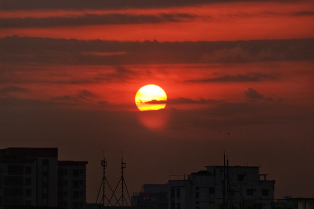
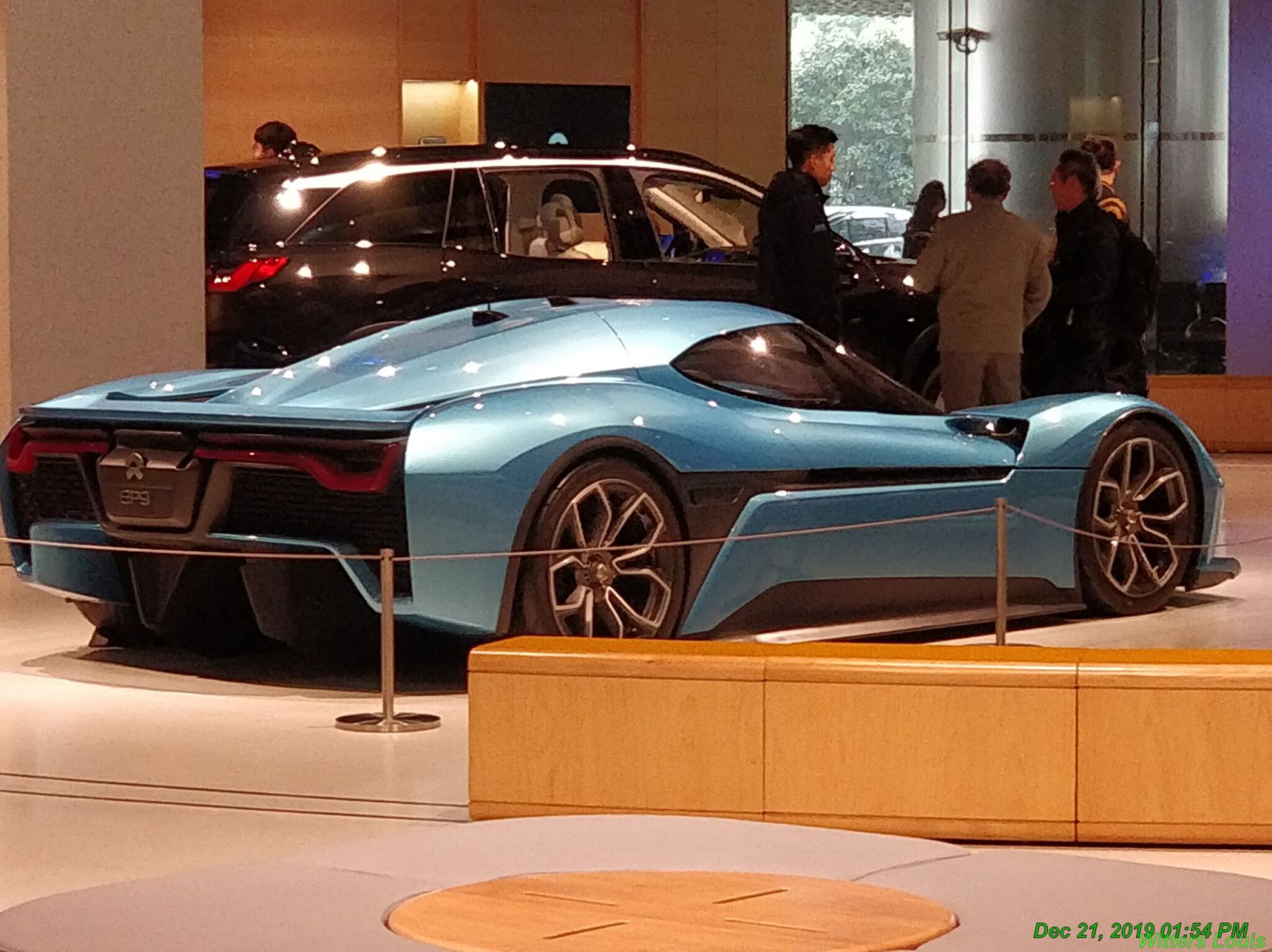
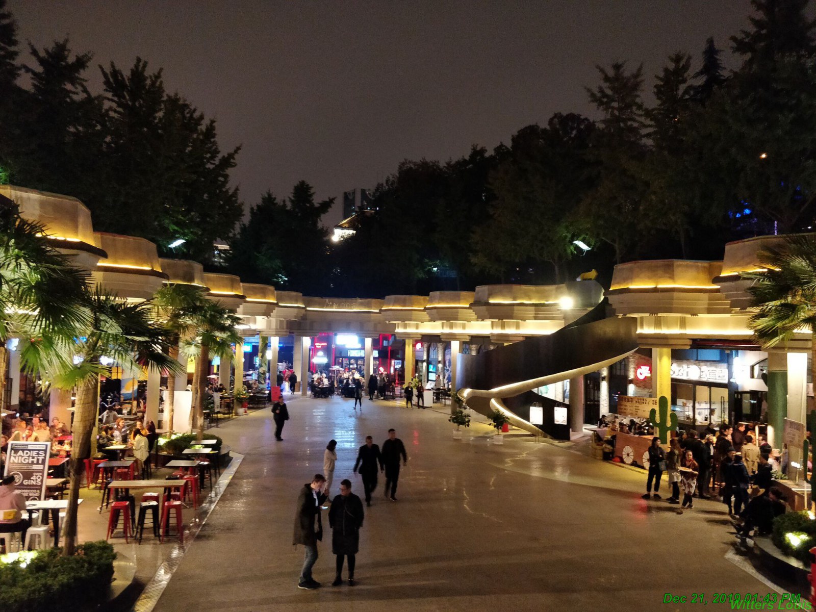
        &lgt;div id="container1">
          &lgt;div class="lw-image" style="--overlay-color: hotpink">
            &lgt;div class="image-wrapper">&lgt;img src="../images/13a.jpg"/>&lgt;/div>
            &lgt;h4 class="title" data-cta="Ready for a drink →">Sunset!&lgt;/h4>
          &lgt;/div>
          &lgt;div class="lw-image" style="--overlay-color: yellow">
            &lgt;div class="image-wrapper">&lgt;img src="../images/17.jpg"/>&lgt;/div>
            &lgt;h4 class="title" data-cta="Ready to drive →">Racing time!&lgt;/h4>
          &lgt;/div>
          &lgt;div class="lw-image" style="--overlay-color: dodgerblue">
            &lgt;div class="image-wrapper">&lgt;img src="../images/25.jpg"/>&lgt;/div>
            &lgt;h4 class="title" data-cta="Ready for fun →">Night life!&lgt;/h4>
          &lgt;/div>
          &lgt;div class="lw-image" style="--overlay-color: darkgreen">
            &lgt;div class="image-wrapper">&lgt;img src="../images/26.jpg"/>&lgt;/div>
            &lgt;h4 class="title" data-cta="Ready to receive →">Delivery!&lgt;/h4>
          &lgt;/div>
        &lgt;/div>
        &lgt;style>
            #container1{display: grid; grid-template-columns: repeat(4,1fr); grid-auto-rows: minmax(2vw, auto); border: 0.2vw solid blue; width: 80vw; height: 20vw; margin-left: 10vw;}
            .lw-image {position: relative; margin-top: 2vw;cursor: pointer; width: 15vw;  height: 15vw;}
            .title {font-size: 1.2vw; display: flex; align-items: center; position: relative; left: 0; bottom: 0; font-weight: 600; line-height: 1.2; white-space: nowrap; transform: translate(10%, -50%); transition: transform 0.5s ease-in; pointer-events: none;}
            .title::after {content: attr(data-cta); display: inline-block; margin-left: 1vw; font-size: 1vw; font-weight: 400; letter-spacing: 0.125vw; opacity: 0; transform: translateX(-25%); transition: transform 0.5s ease-out; opacity: 0;}
            .image-wrapper {width: 15vw; height: 15vw; overflow: hidden; -webkit-clip-path: polygon(100% 0, 100% 50%, 100% 100%, 0% 100%, 0 50%, 0% 0%); clip-path: polygon(100% 0, 100% 50%, 100% 100%, 0% 100%, 0 50%, 0% 0%); transition: transform 0.5s ease; -webkit-clip-path: polygon(100% 0, 100% 50%, 100% 100%, 0% 100%, 0 50%, 0% 0%); -wekbit-transition: transform 0.5s ease;}
            .image-wrapper img {position: relative; width: 100%; height: 100%; -o-object-fit: cover;  object-fit: cover; transform: translateX(10%); transition: transform 0.5s ease-out;}
            .image-wrapper::after { content: ""; position: absolute; top: 0; left: 0; width: 100%; height: 100%; background-color: pink; mix-blend-mode: multiply; opacity: 0; transform: translateZ(0); transition: opacity 0.5s ease-out;}
            .lw-image:hover img {transform: translateX(0);}
            .lw-image:hover .image-wrapper {-webkit-clip-path: polygon(75% 0%, 100% 50%, 75% 100%, 0% 100%, 25% 50%, 0% 0%); clip-path: polygon(75% 0%, 100% 50%, 75% 100%, 0% 100%, 25% 50%, 0% 0%); transform: translateX(25%); transition-timing-function: step-start;}
            .lw-image:hover .title {transform: translate(5%, -50%); transition-timing-function: var(--bounce-out);}
            .lw-image:hover .title::after {opacity: 1; transform: translateX(0); transition-timing-function: step-end;}
            .lw-image:hover .image-wrapper::after {opacity: 1;}